Singapore’s financial, tech, and e-commerce sectors—think DBS, Grab, Shopee, and Singtel—are heavily investing in Power BI talent. Recruiters here want proof of your ability to analyse data and communicate insights with clarity. A polished Power BI portfolio can give you the edge in a competitive job market by highlighting the projects and dashboards that show your problem-solving skills in action.
🔽 Table of Contents
- Why Your Power BI Portfolio Matters
- What Employers Look For in a Power BI Portfolio
- Step-by-Step Guide to Building Your Portfolio
- Real Portfolio Examples (with Analysis)
- Extra Boosters to Stand Out
- Final Checklist Before You Apply
- Bonus: Free Portfolio Template Download
- Conclusion: Make Them Want to Hire You
- Frequently Asked Questions on Power BI Portfolios
Why Your Power BI Portfolio Matters
A strong Power BI portfolio proves you can translate raw data into actionable insights. Employers are less impressed by flashy visuals and more focused on whether your dashboards answer critical business questions. For example, a sales manager wants to know why revenue is dropping, not just see a colourful chart. Your portfolio should show that you understand the business problem, use the right metrics, and design visuals that make decision-making easier.
Another benefit of a portfolio is that it allows you to highlight your thinking process. By documenting how you sourced data, cleaned it, and built dashboards, you give recruiters confidence in your technical and analytical skills. It also sets you apart from candidates who only rely on certifications or resumes.
Related: Top 70+ Power BI Interview Questions and Answers
What Employers Look For in a Power BI Portfolio
A Power BI portfolio is more than a showcase of colourful charts — it’s a reflection of how you think like an analyst. Employers are scanning your projects for three main things: clarity, problem-solving, and business impact. If your dashboards look good but fail to answer the right questions, you risk being overlooked. Here are the qualities hiring managers consistently value in a portfolio.
- Clear problem definition: Your projects should start with a business problem, not just data exploration. For example, “Why are sales declining in Region X?” is far stronger than “Sales dashboard with charts.”
- Data storytelling: Dashboards should guide the viewer through insights step by step. Employers look for logical flow, meaningful KPIs, and clear narrative, not visual clutter.
- Business context: Numbers without context mean little. Show how the insight affects decision-making, whether it’s reducing churn, improving operations, or boosting profitability.
- Clean design: Minimal visuals with strong emphasis on usability, accessibility, and focus. Employers dislike “chart overload” — one dashboard should answer one business question.
- Technical depth: Demonstrating DAX formulas, Power Query transformations, and advanced modeling is a plus, but only when tied to solving a real business scenario.
Hiring managers also keep an eye out for common mistakes that weaken a portfolio:
- Overly flashy visuals that distract from the actual insight.
- Dashboards that lack a clear business problem statement.
- No documentation of process — leaving recruiters guessing about your approach.
- Projects that rely only on sample datasets without business relevance.
Think of your portfolio as a case study collection. Each project should make it clear: here’s the problem, here’s the data, here’s what I built, and here’s why it matters. This simple formula makes employers remember you — not your competitors.
Related: Data Analyst Resume: Samples & Examples
Step-by-Step Guide to Building Your Portfolio
Building a Power BI portfolio doesn’t have to feel overwhelming. The best portfolios are structured, purposeful, and easy for recruiters to navigate. Follow these five steps to create a portfolio that highlights your skills and makes you stand out in the hiring process.
Step 1: Choose Business-Driven Projects
Avoid generic dashboards like “Superstore Sales.” Instead, focus on projects that answer real business questions. Employers want to see how you solve problems they deal with every day.
- Customer churn analysis for a telecom company.
- Sales forecasting for a retail chain.
- HR attrition dashboard with employee retention insights.
- Executive summary for revenue performance.
Pro tip: Use free datasets from Kaggle, Makeover Monday, or government data portals to add credibility to your projects.
Step 2: Create Clean, Focused Dashboards
Each dashboard should answer one business question clearly. Employers scan for usability — they want dashboards that executives can understand at a glance.
- Stick to 1–2 visuals per question.
- Use consistent colour schemes for readability.
- Leverage slicers, tooltips, and bookmarks to add interactivity.
Step 3: Document Your Thinking
A Power BI portfolio is incomplete without context. Employers want to see your thought process — not just the final charts.
For every project, include a short write-up with:
- Problem statement: What business challenge are you addressing?
- Approach: How did you model the data and build the dashboard?
- Outcome: What insights did you discover?
- Business impact: Why do these insights matter?
Step 4: Version Control & Hosting on GitHub
Employers appreciate candidates who treat their portfolio like a professional codebase. Hosting on GitHub signals credibility and attention to detail.
- Use a clear folder structure:
/Reports/,/Data/,/Writeups/. - Add a
README.mdwith project summaries, screenshots, and tools used. - Include links to published dashboards on Power BI Service.
Step 5: Publish & Share Your Work
Once ready, publish your dashboards to Power BI Service and generate shareable links. Add them to your LinkedIn “Featured” section, personal website, or Notion portfolio page. Make sure sensitive data is anonymised or replaced with dummy datasets.
- Create a Power BI “app” to package multiple dashboards.
- Use publish-to-web carefully, ensuring no private information is exposed.
- Always include a call-to-action: “Contact me for more projects” or “Hire me.”
Following this structure shows employers not only what you’ve built but also how you think — which is exactly what separates strong analysts from the rest.
Related: Professional Resume Templates & Writing Tips
Real Portfolio Examples (With Analysis)
Looking at how others structure their Power BI portfolios is one of the fastest ways to improve your own. Below are examples of real portfolios and dashboards that demonstrate what works — and what could be improved. Use them as inspiration to refine your own portfolio projects.
Example 1: Sales Performance Dashboard
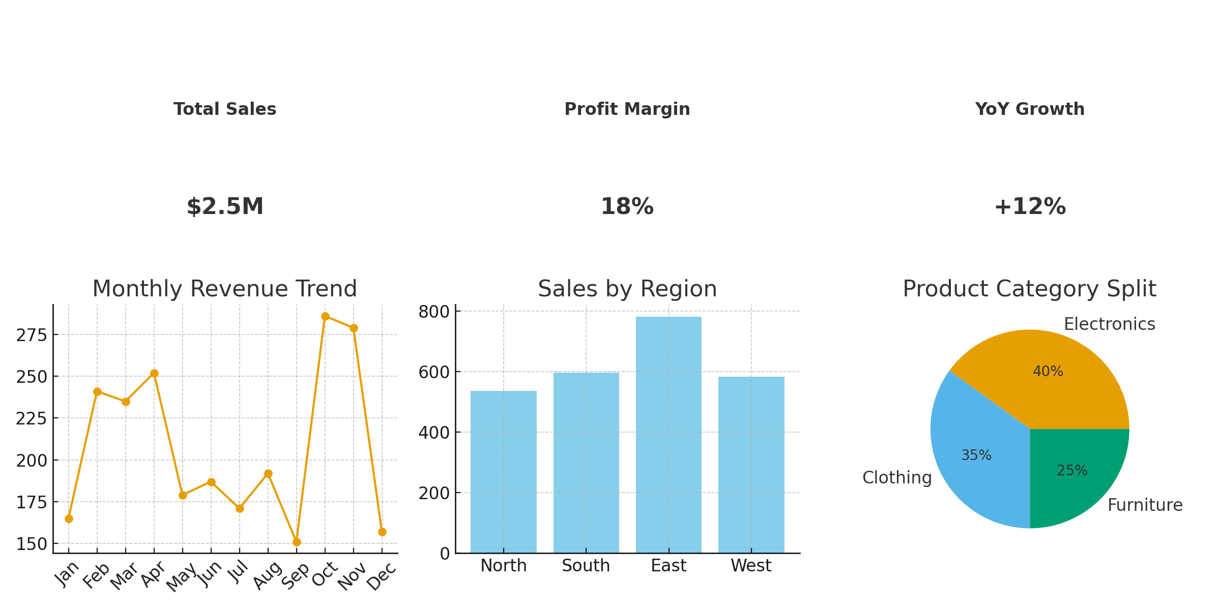
What works: This dashboard focuses on a single business goal, understanding monthly revenue trends. The visuals are clean, with KPIs for sales, profit margin, and regional growth. Interactive slicers allow users to drill down by product or geography, which recruiters love.
What could be better: The project description is missing. Employers don’t just want numbers; they want to know why sales dipped in Q3 and what actions the business could take. Adding a business context write-up would make it far more compelling.
Example 2: HR Attrition Analysis
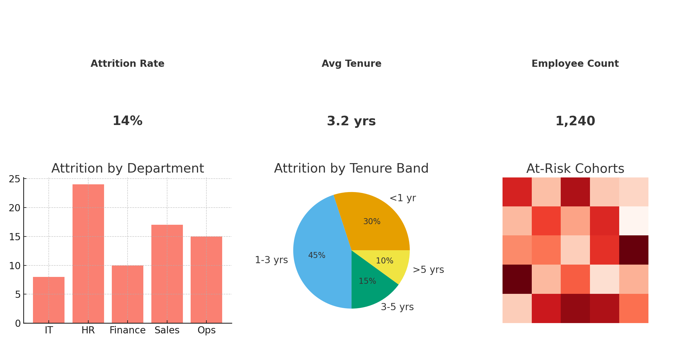
What works: This portfolio project shows strong data storytelling. The analyst explains the business problem (high employee turnover), uses measures like attrition rate by department, and finishes with a clear recommendation: improving onboarding and training in specific teams.
What could be better: Visuals are slightly cluttered. Remember: one dashboard = one clear question. Streamlining the charts into 2–3 strong visuals would improve readability.
Example 3: Customer Churn Prediction
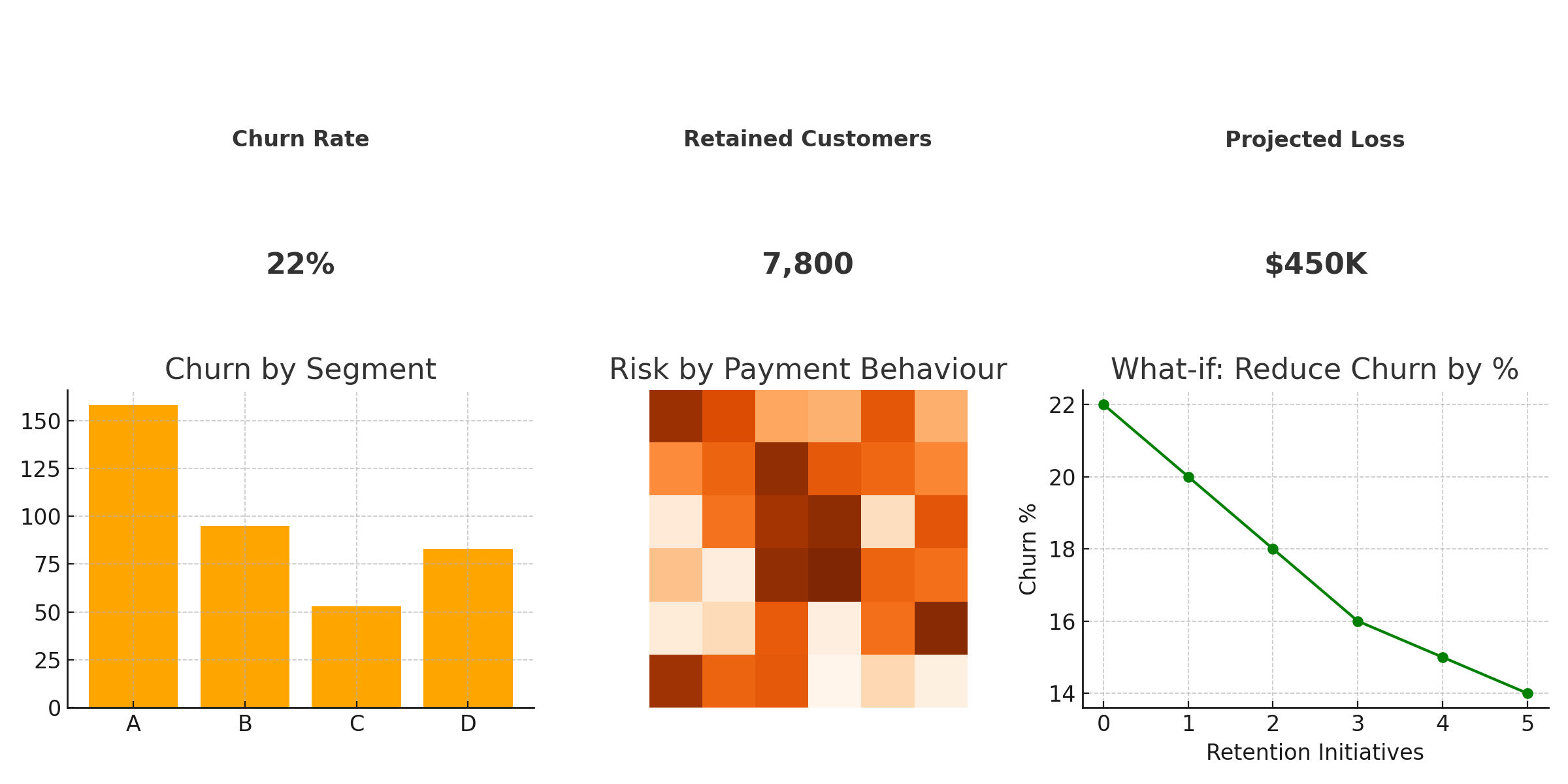
What works: This advanced project integrates DAX measures and predictive modeling to flag at-risk customers. The documentation includes data sources, transformations, and reasoning behind chosen metrics; exactly what employers want to see.
What could be better: The visuals are technically sound but lack executive-level summaries. Recruiters and managers prefer a top-line takeaway like: “Churn risk highest among customers in Segment B with 2+ missed payments.”
These examples show that the strongest Power BI portfolios balance visual clarity, problem-solving, and business impact. If you can explain what the data means in simple terms and back it with clean visuals, your portfolio will instantly stand out to recruiters.
Related: Interview Questions: Prepare for Your Next Job
Extra Boosters to Stand Out
Once you’ve built the essentials, a few smart add-ons can make your Power BI portfolio unforgettable. These ideas help you showcase creativity, professional branding, and initiative beyond the standard dashboards.
- Build an interactive CV dashboard: Instead of a plain resume, create a Power BI dashboard that visualises your career journey, key projects, certifications, and skills. Hiring managers love this modern twist.
- Leverage LinkedIn “Featured” section: Add links to your published dashboards or GitHub portfolio so recruiters can explore your work directly from your profile.
- Custom portfolio site or Notion hub: Host your dashboards on a personal domain or Notion page for a polished, centralised showcase.
- Include advanced features: Add bookmarks, drillthroughs, or what-if analysis to show you’re comfortable with Power BI’s advanced functionality.
These boosters aren’t mandatory, but they can set you apart when competing for top roles. A recruiter might see ten similar dashboards, but the candidate who shows an interactive CV dashboard linked on LinkedIn will be the one they remember.
Related: Data Analyst Interview Questions and Answers
Final Checklist Before You Apply
Do a quick quality sweep before you add your portfolio to applications or LinkedIn. Tick off the essentials below to make a strong first impression.
- 3+ business-driven dashboards covering different domains (e.g., Sales, HR, Churn) with clear problem statements.
- One advanced project demonstrating DAX, data modeling, or scenario/what-if analysis.
- Executive summary view on at least one dashboard (top KPIs + one-line insights for decision-makers).
- GitHub repo with tidy folders (
/Reports,/Data,/Writeups) and a richREADME.md(screens, tools, links). - Live links to published dashboards (Power BI Service or safe publish-to-web) with dummy/anonymised data only.
- Short write-ups per project: Problem → Approach → Insights → Business Impact.
- Clean, focused design (1–2 visuals per question, consistent colours, accessible fonts).
- Data hygiene & privacy: remove PII, cite sources, and include a short data disclaimer if needed.
- Performance check: fast load, no broken slicers, bookmarks/drillthrough working as intended.
- Call-to-action on portfolio page: “Contact me”, “Hire me”, or LinkedIn profile link.
Quick polish tips: use consistent file names (e.g., powerbi_sales_dashboard.png), compress images for faster page loads, and add alt text that describes the insight (not just the chart type).
Bonus: Free Portfolio Template Download
Save time and ship a polished portfolio faster. Download this free pack with a Notion-ready checklist, project write-up template, GitHub README, folder structure, and a QA checklist that hiring managers care about.
- Portfolio inventory table (Notion/website columns)
- Project write-up template: Problem → Data & Method → Insights → Business Impact
- GitHub README with sections for measures, screenshots, and links
- Folder structure:
/Reports,/Data,/Writeups+README.md - Publish & QA checklist (privacy, interactivity, performance)
- Review rubric mirroring employer expectations
⬇️ Download: Power BI Portfolio Checklist & Templates (PDF)
How to use: Import the Markdown into Notion or your CMS, duplicate the write-up template per project, keep your GitHub README in sync, and run the QA checklist before you publish links on LinkedIn or job applications.
Related: Business Analyst vs. Data Analyst: Choosing the Right Path
Conclusion: Make Them Want to Hire You
A strong Power BI portfolio in 2026 isn’t about fancy charts. It’s about how you think like an analyst—framing business problems, picking the right metrics, telling a clear story, and proposing actions that move the needle.
Keep it simple, useful, and credible. Show 3–5 focused projects. Explain the problem. Prove the insight. State the impact. That’s what hiring managers remember when they choose who to interview.
One-week polish plan:
- Day 1: Pick a domain (Sales, HR, Churn). Tighten one project around a single question.
- Day 2: Clean visuals. Limit to 1–2 charts per question. Add an executive summary tile.
- Day 3: Write a crisp case study: Problem → Method → Insights → Business Impact.
- Day 4: Push to GitHub with
README.md, screenshots and tidy folders. - Day 5: Publish to Power BI Service. Verify slicers, bookmarks, and drillthrough.
- Day 6: Ask for feedback from a mentor or peer. Fix clarity issues.
- Day 7: Add links to your portfolio site and LinkedIn “Featured” section.
Final nudge: Ship, then iterate. Your portfolio is a living product, update it with new projects and sharper stories as you grow. Make it easy to view, easy to trust, and easy to contact you.
Related: Skills and Best Practices to Become a Great Data Analyst
Frequently Asked Questions on Power BI Portfolios
🔽 What should a Power BI portfolio include?
Show 3–5 projects with: a clear business problem, clean dashboard answering one question, short write-up (Problem → Method → Insights → Business Impact), and links to your GitHub + live dashboard. Add one executive summary view for decision-makers.
🔽 How many projects are enough for a beginner?
Start with three: Sales performance, HR attrition, and Customer churn. Each should use real or well-documented public data and include a short README. Quality beats quantity.
🔽 Can I use sample or public datasets?
Yes. Use Kaggle, Makeover Monday, or government portals. Add context: define a believable business question, state assumptions, and explain why the insight matters.
🔽 Should I share the PBIX files?
Optional. Many candidates share screenshots/GIFs + a hosted view (Power BI Service). If you share PBIX, remove credentials/PII and include a data dictionary or README.
🔽 Is advanced DAX required to get interviews?
No, but one project showing solid modeling and a few meaningful measures helps. Focus on problem-solving and clarity first; add DAX depth where it supports the story.
🔽 How do I host and share my dashboards safely?
Prefer Power BI Service (apps or workspace links). Use “publish to web” only for non-sensitive, dummy/anonymised data. Never expose private endpoints or credentials.
🔽 What makes a dashboard “portfolio-ready”?
Single purpose, minimal visuals (1–2 per question), consistent colours, accessible labels, smooth interactions (slicers, drillthrough, bookmarks), and a one-line takeaway.
🔽 Where should I place portfolio links on LinkedIn?
Use the “Featured” section for your best project, add the full portfolio link in the About section, and reference specific dashboards in Experience or Projects.